Trust, by design.
A digital CBT platform. Therapist-led, multi-stakeholder, end-to-end.
A mental health service where the platform itself was getting in the way.
A digital cognitive behavioral therapy platform serving 500K+ active users across web responsive and native mobile.
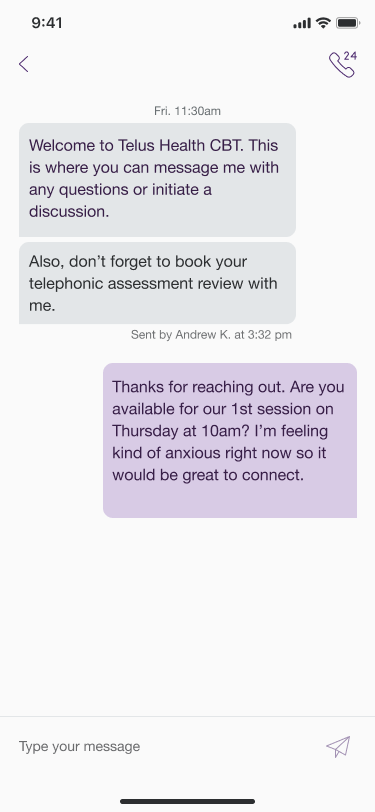
I led the patient-side experience end-to-end: onboarding, booking, dashboard, program tracking, and therapist communication. The kind of product where every design decision has clinical consequences. A confusing step doesn't just lower a conversion rate. It loses someone at the moment they were brave enough to ask for help.
The work that follows is what happens when you start with the data instead of the brief, and let what users are actually saying reshape the scope.
Strongly positive content. Frequently frustrating product.
That single line in the executive summary of a 62-comment client feedback synthesis reframed how I scoped the work.
Users praised what CBT was teaching them. "One of the most positive things I've ever done for myself," "I have learned a lot," "my support mentor was fantastic." What they were struggling with was the platform itself.
The therapy itself was working. The product needed to catch up.
I started with the data.
I synthesized 62 qualitative client comments across 9 program modules and 5 industry contexts into 8 human-centered needs. Each one anchored to a verbatim user quote (Job-To-Be-Done), the evidence pattern in the data, and a clinical-risk rationale.
I ran a workshop in February 2026 with five former CBT clinical-content providers (Jennifer, Sierra, Jana, Patrick, and Deryn) to surface what the experience looked like from the people who had supported clients through it. Their inputs flowed into the service blueprint, persona work, and research priorities.
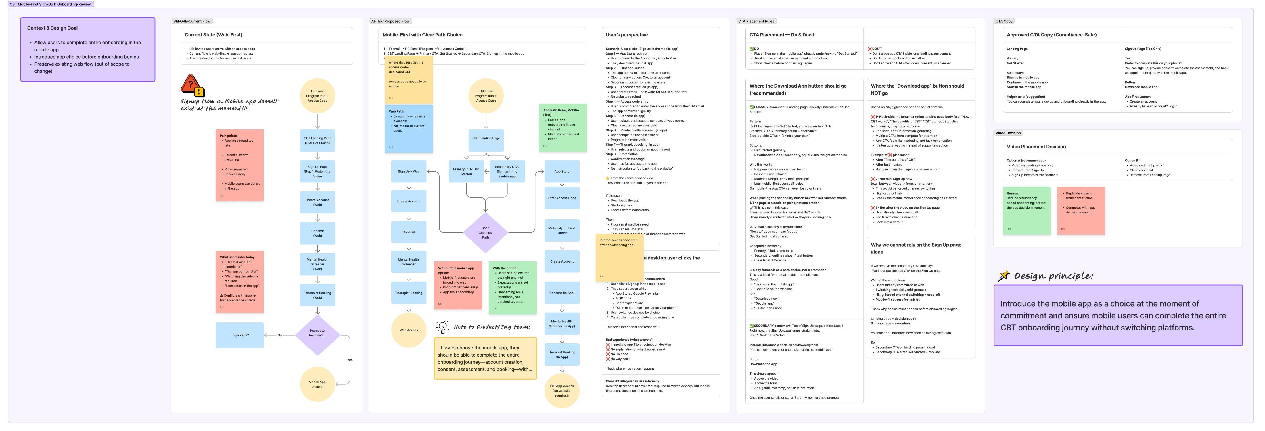
And I audited the signup flow end-to-end, mapping where the experience was forcing platform switching and proposing a mobile-first design principle to fix it.
How it actually came together.
Six pieces from the work, direct from the research artifacts. The numbers, the quotes, and the synthesis are real, pulled from client feedback, signup-flow analysis, and a workshop with former clinical providers.
62 client voices. Nine modules. Five industries.
Qualitative comments from active CBT clients across nine program modules: anxiety, depression, sleep, burnout, trauma support, grief & loss, social anxiety, GMT, and combined anxiety + depression.
The cohorts: employees of financial institutions, paramedical, public service, insurance, and government.
One verbatim line surfaced everywhere: “It's emotionally painful to pour my heart in and watch it disappear.”

Mobile-first by intent. Web-first by accident.
One board, six decisions. The artifact worked through the existing web-first flow, the proposed in-app flow, the user-perspective scenario, the CTA placement rules (where the “Download App” button should and shouldn't live), the compliance-safe copy options, and the video-placement decision. All anchored to a single design principle.
The redesigned 7-step flow runs entirely inside the app for mobile users (App Store → first launch → account → consent → screener → therapist booking → confirmed). Existing web flow preserved as the alternative path for desktop users.
Five former providers. One afternoon. Ground truth.
February 5, 2026. Five former CBT clinical-content providers, all of whom had supported clients through the program before moving into other roles.
Five-session structure: context → silent input on provider workflow + client experience → silent input on engagement + drop-off → group highlights and patterns → forward-looking reflection.
Outputs flowed directly into the service blueprint, persona work, and research priorities.

Strongly positive content. Frequently frustrating product.
One sentence in the executive summary reframed the scope of the work for me. The praise and the friction were on different layers: clients loved the therapy, they were tripping on the platform.
The data pointed in one direction: this is not just a UX issue. It actively undermines therapeutic safety and trust. CBT depends on honesty and reflection. Technical failure breaks the therapeutic contract.
I clustered the evidence into eight human-centered needs: Psychological Safety, Cognitive Support Under Stress, Continuity & Context, Ownership of Learning, Flexible Engagement, Human Presence, Guided Momentum, Respect for Emotional Effort. Each need anchored to a JTBD quote and a clinical-risk rationale.
This is what the service blueprint, personas, and research priorities were built on. Not assumptions.

Four lanes. Five phases. One failure point.
The blueprint translated the synthesis into a system view: what the user feels, what they see, who is working behind the curtain, and what data has to be true for any of it to hold.
The most useful thing it did was not describe the happy path. It made the failure point visible: in Phase 03, if screener responses don't persist, the therapeutic contract breaks before it starts. The blueprint let product, engineering, research, and clinical content all point at the same risk in the same place.

What that turned into.
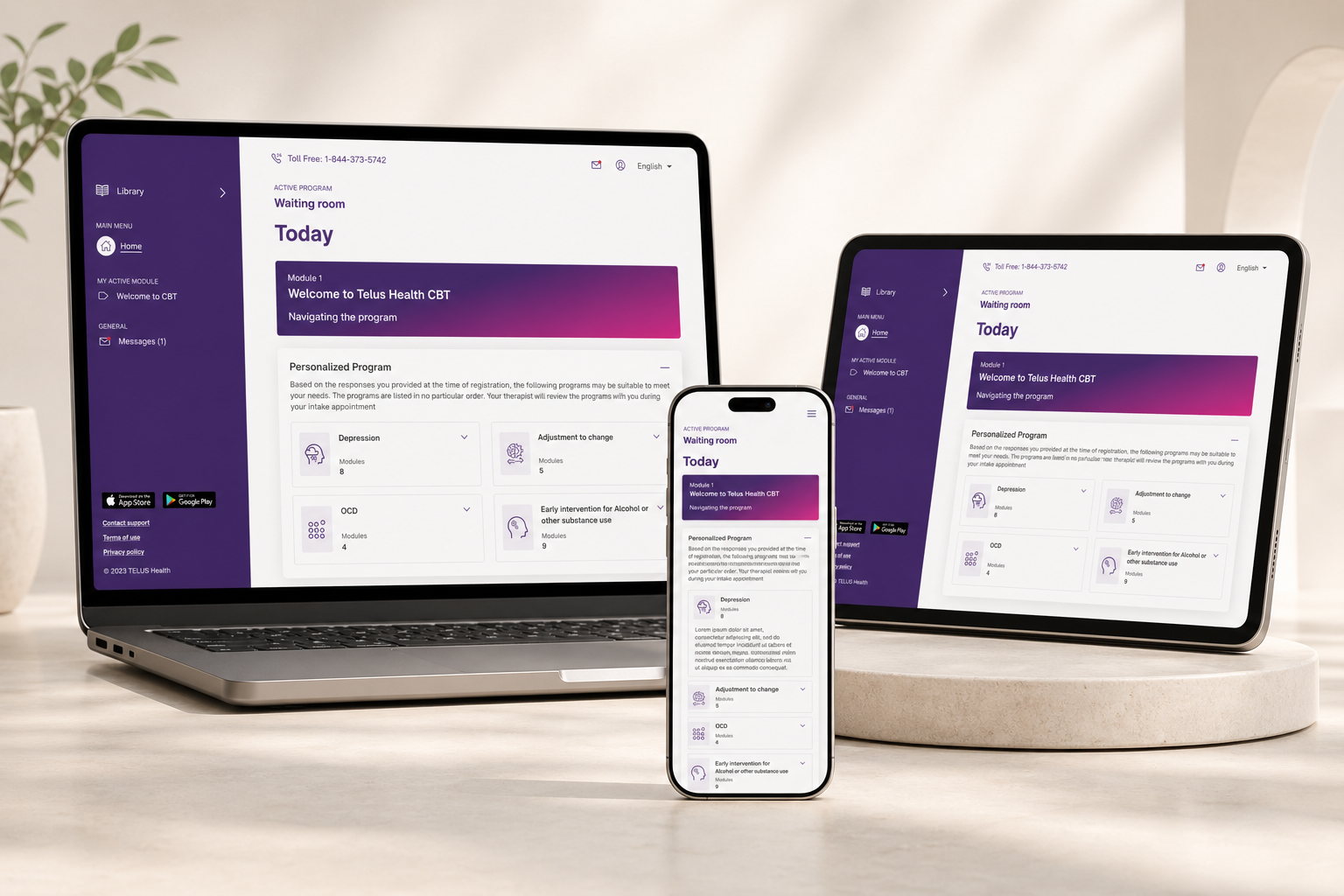
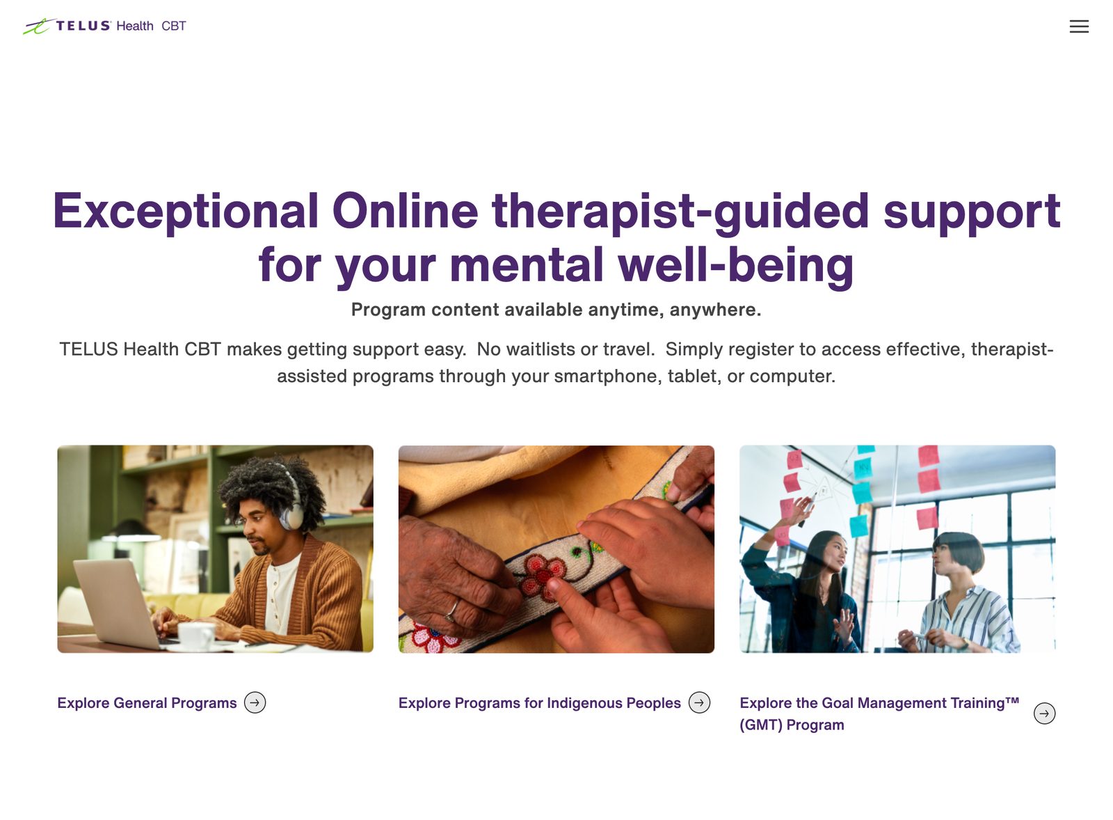
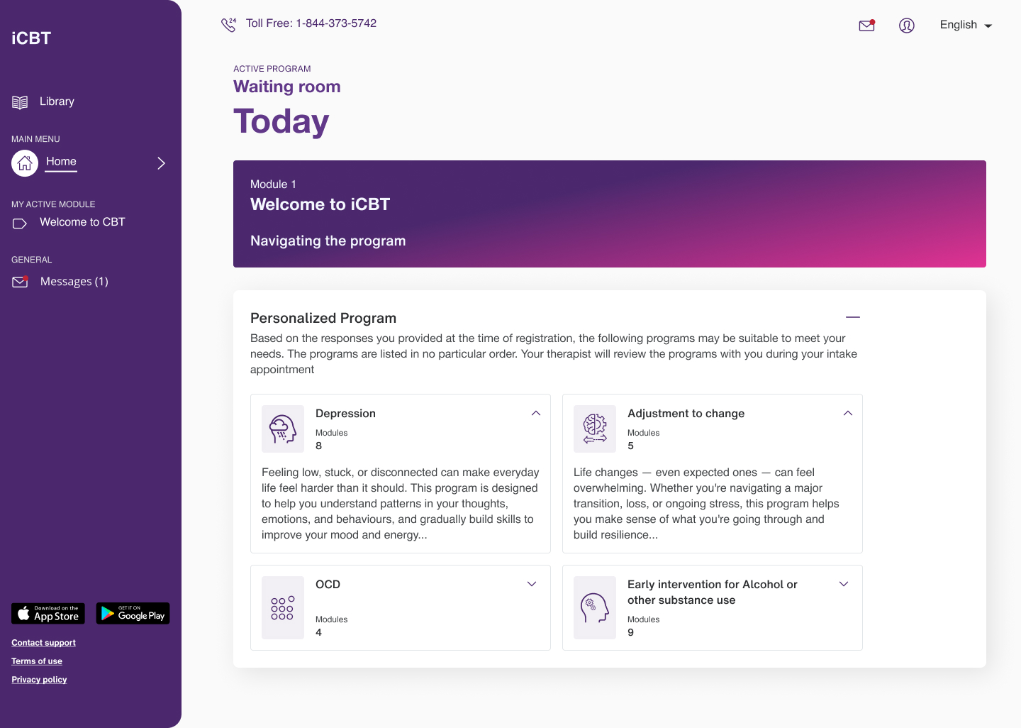
Public-facing surfaces, shipped.
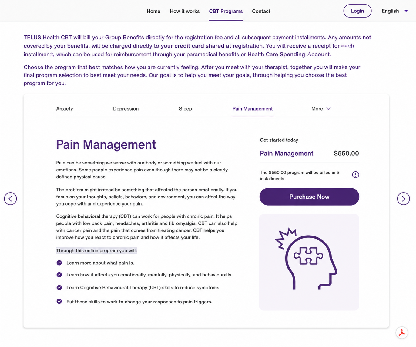
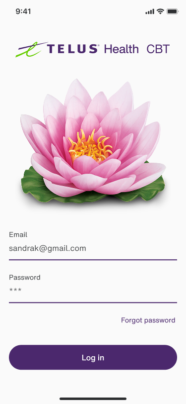
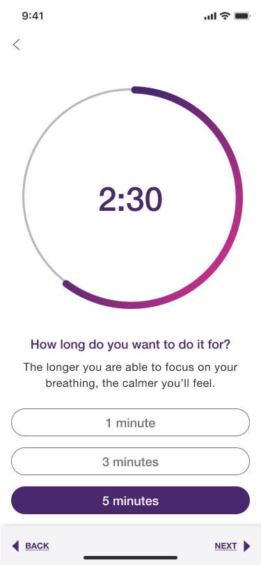
Real screens from the patient-facing CBT product as it ships today. The desktop entry surfaces and the mobile in-app program experience. Surfaces I owned end-to-end across both platforms.
Walk-through prototype available on request.
The full Figma prototype, internal research artifacts, and the unredacted service blueprint live behind a permission gate. Email me. I'll share the prototype link or screen-share through it in a working session.
Directional, NDA-safe.
- The needs framework became the shared vocabulary product strategy used in roadmap and prioritization conversations. Weeks of debate about “what to build” collapsed into days of agreement on “what to solve.”
- The mobile-first design principle was adopted as the basis for the signup-flow redesign, preserving the existing web flow while removing platform-switching friction for mobile users.
- Service blueprints became foundational artifacts for cross-team alignment between product, engineering, research, and clinical content. Conversations moved from “what should we ship” to “what does the system need to do.”
- The provider workshop synthesis became the persona and research foundation that subsequent CBT product decisions referenced, replacing assumptions with named, evidence-backed needs.
- Across the work, the platform supported 500K+ active users in care across nine program modules and five industry contexts.
No flashy lift numbers here. The change was operational: roadmap-prioritization debates that used to start with “what should we ship” started with “what does the system need to do.” The needs framework was the document the room agreed on first, before any feature spec.
What I learned.
Therapeutic effectiveness and product effectiveness are not the same thing. The gap between them is where harm lives. A clinically excellent program delivered through an unstable platform isn't a UX problem with a clinical side-effect. It's a clinical problem caused by a UX failure. Reframing the work that way changed how I prioritized.
Service design pulls weight no individual screen can. The eight human-centered needs were what aligned a cross-functional team that had been working from different definitions of "this is working." Once the synthesis existed, every roadmap argument got better.
What I'd do differently. I'd surface the data-loss issue with engineering even earlier. The kind of cross-functional, technical-failure-as-clinical-risk framing the data made obvious in retrospect. The earlier that lands, the less ground you give back.
A lot of mental health products try to solve trust through tone: softer copy, gentler colors. That's table stakes. Real trust is built into the system: the data persistence, the platform consistency, the way the product behaves when something goes wrong. Tone gets you in the door. Systems keep people in the room.