← Back to all work
Case study · 02

Money, made kinder.

A financial wellbeing product built from the same research it was designed to move.

myFinances by LifeWorks: desktop dashboard with companion mobile preview
Role
Lead UX Designer. End-to-end ownership of dashboards, navigation, and financial data flows. Built the personalization engine and the interactive prototypes used in enterprise sales demos.
Stakeholders
Product manager, development team, VP of Product. All major decisions worked through this triad.
Timeline
TELUS Health / LifeWorks · 2021–2022 · Desktop web · Retired when TELUS Health re-platformed its wellbeing portfolio
01. The hook

Mental and physical wellbeing already had a home. Money didn't.

LifeWorks (now TELUS Health) ran one of the largest employer-paid wellbeing platforms in Canada. The mental side and the physical side were already mature surfaces. The financial side, the one employees were the most stressed about and the least willing to talk about, was missing.

I led design on the product that filled that gap: myFinances, a desktop web experience offered to Canadian employees through their employers. The brief from product leadership was simple. The same internal research team that published the quarterly Financial Wellbeing Index had a 30-page report on what was breaking in Canadians' financial lives. The product had to actually move those numbers.

02. Context & problem space

The research wasn't hypothetical. It was a 64.0.

The internal Financial Wellbeing Index surveyed 3,000 working Canadians every quarter. By Summer 2022 the overall score was 64.0, the lowest since the Index launched in 2021. Of the four sub-scores, financial perception (how people felt about money) had fallen the sharpest.

Five numbers from the report shaped the brief.

76% wanted emergency savings as a top priority.
FWI Summer 2022, n=3,000. The most common stated goal across the working population.
47% didn't know how to choose a financial planner.
This group's wellbeing score was 11+ points below the national average.
29% were concerned about basic monthly living expenses.
Concentrated in parents, women, employees under 40, and households under $60K.
23% feared mortgage payments if rates rose above 3%.
A bank-rate hike was both real and imminent during design and build.
56% said more financial education would help them.
Younger employees were 40% more likely to agree than older ones.

Each of those numbers had a person attached: a 28-year-old gig worker, a 45-year-old single parent, a 60-year-old approaching retirement. All on the same employer plan, all with a different reason to feel behind. The product had to mean something to all of them, on the same canvas, while the employer paid for it but never saw who used it.

03. Approach

Every feature traced back to a stat in the report.

The FWI measured four axes: knowledge, behaviour, perception, and productivity impact. I anchored the product to those four pillars and refused to ship a feature that didn't map to one of them. Discipline by design.

Pillar 01 · Knowledge.
Bite-sized lessons across budgeting, saving, debt, investing, credit, home buying, retirement, and tax. Built to address the 56% who wanted more education.
Pillar 02 · Behaviour.
Yodlee account linking and auto-categorization, plus the 30-Day Financial Detox challenge. Aimed at the 76% prioritizing emergency savings.
Pillar 03 · Perception.
A daily mood check-in and a 0–100 wellbeing score banded as Distressed / Strained / Optimal, the same clinical bands the FWI used. Built for the sub-score that fell sharpest.
Pillar 04 · Productivity.
Free 1:1 booking with financial coaches, behavioural therapists, and certified planners. Built for the 47% who didn't know how to find one.

Working sessions ran weekly with the PM, the dev team, and the VP of Product. The hard conversations were not about UI. They were about scope, sequencing, and how loud to make privacy. I argued for fewer, simpler surfaces over a feature-heavy launch. We landed there.

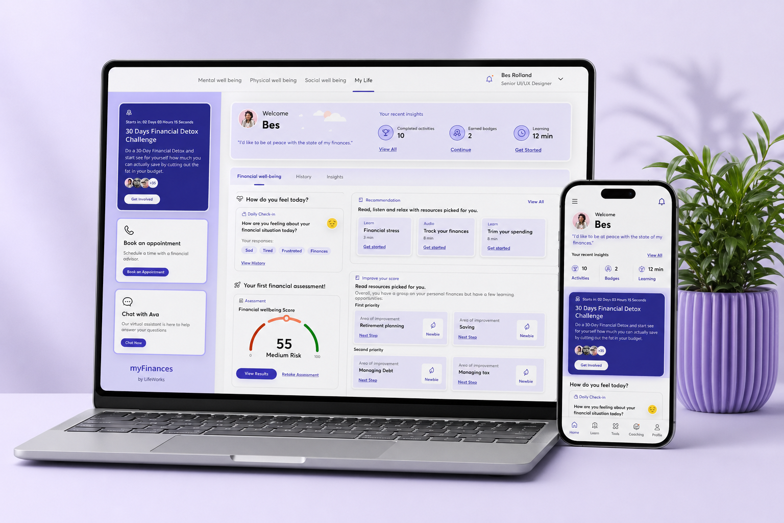
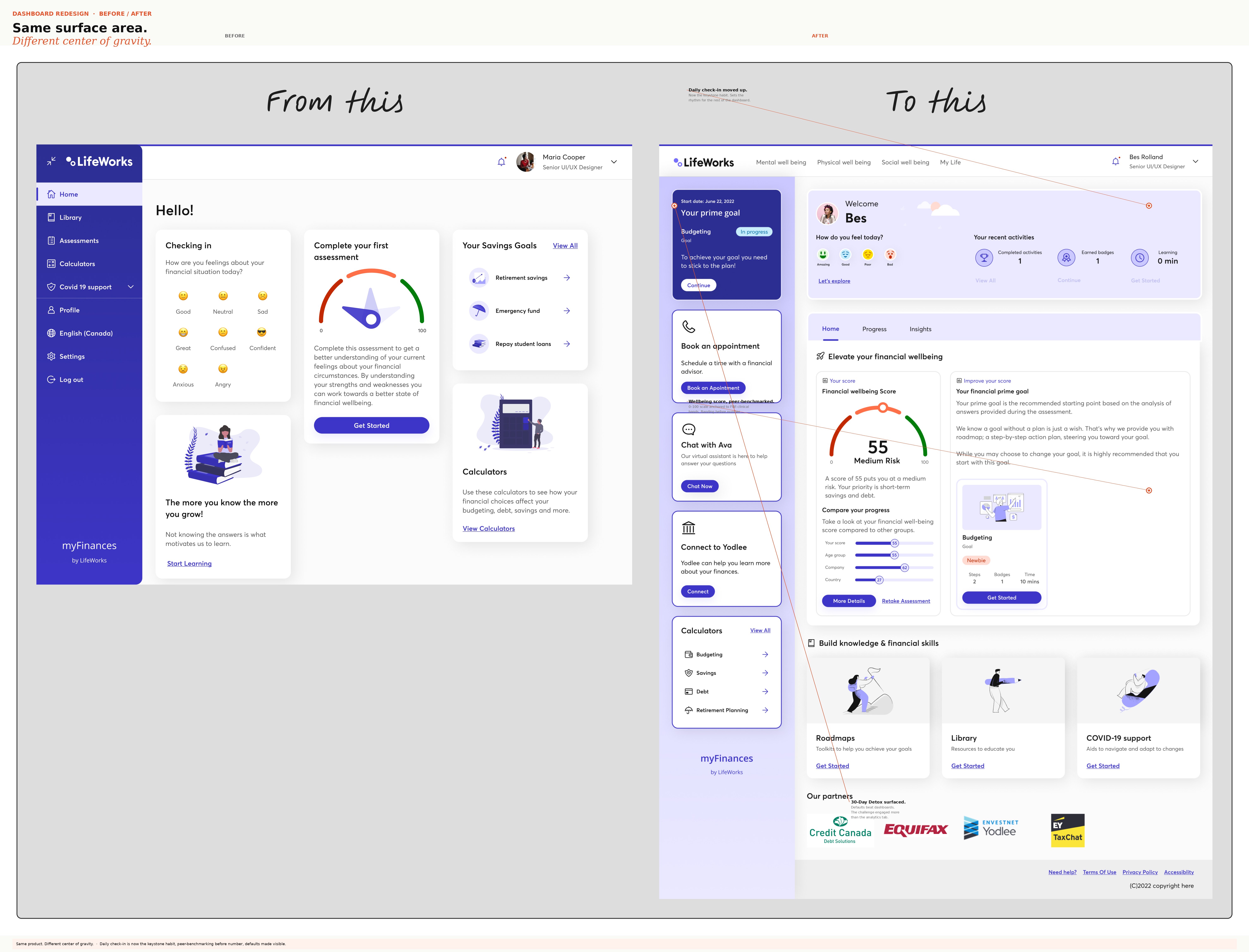
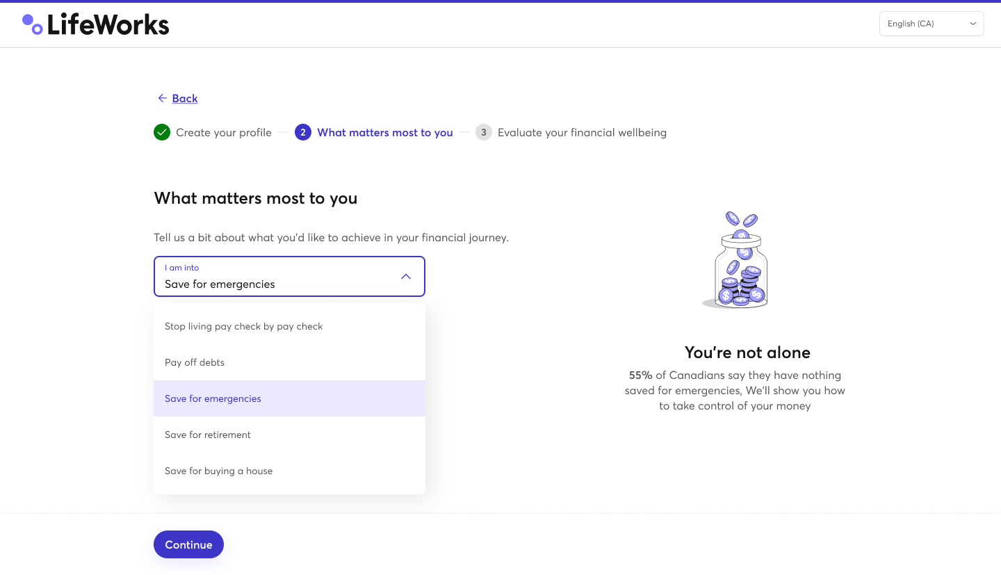
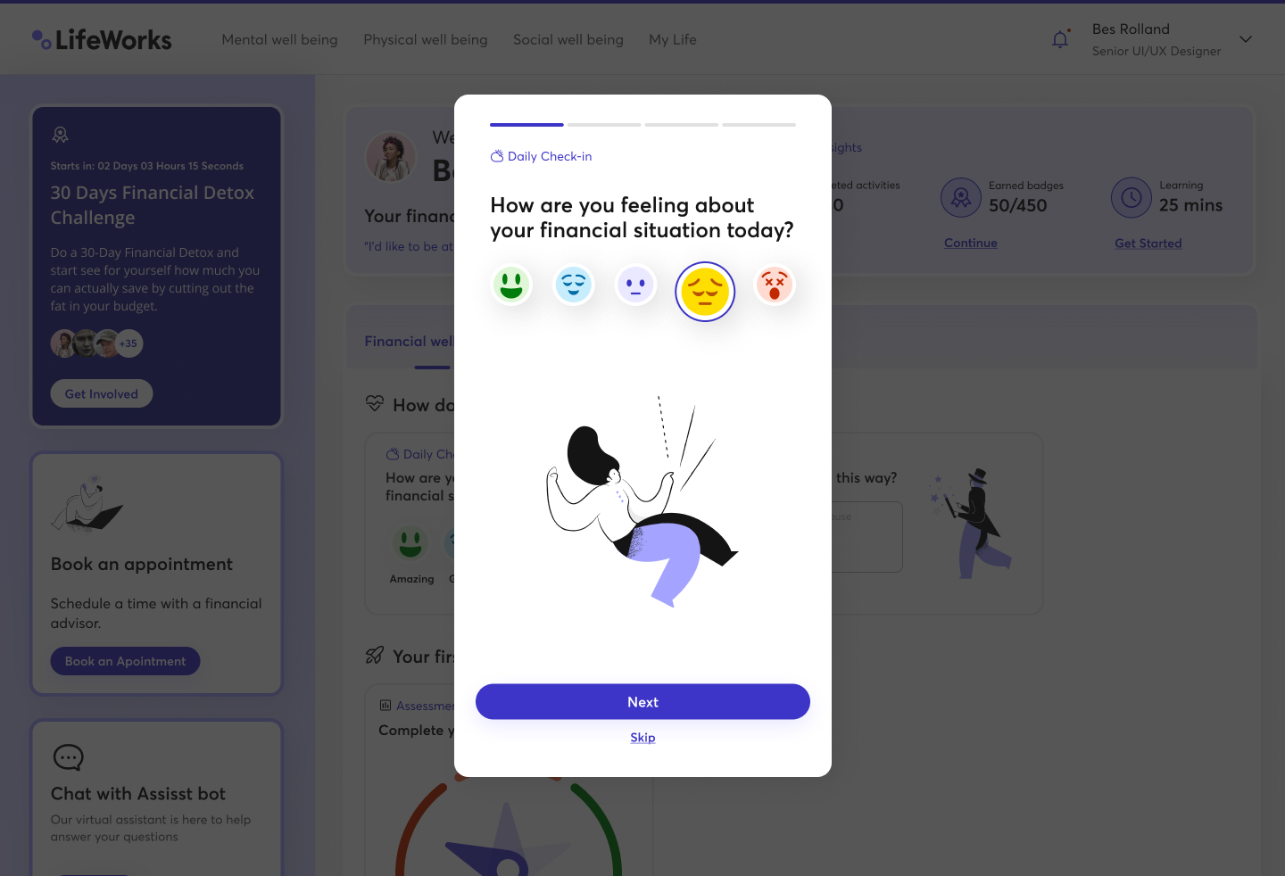
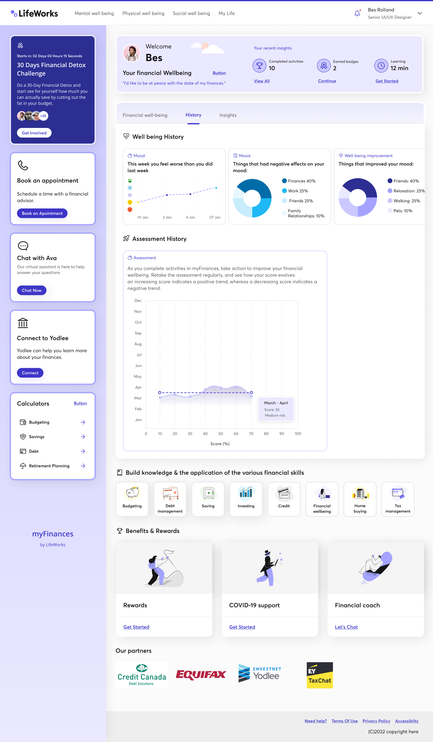
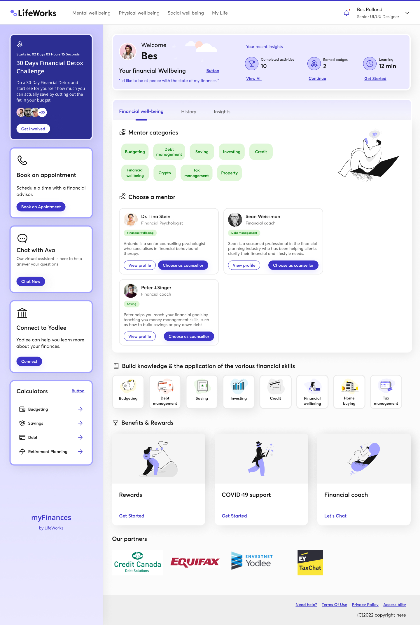
Seven surfaces from the shipped product.

Real screens from myFinances as it was built and demoed in 2022. Surfaces I owned end-to-end, from the assessment-based onboarding to the daily habit loop, the wellbeing score, the redesigned dashboard, and the mentor-booking flow.

myFinances dashboard redesign: before and after with annotated callouts on the daily check-in, wellbeing score, peer benchmarks, improvement priorities, and 30-Day Detox surfaced in the sidebar
01.
Dashboard redesign · before / after
The redesign anchored the experience around a daily check-in, a peer-benchmarked wellbeing score, and a clearer split between “elevate your wellbeing” and “build knowledge.” Same surface area, different center of gravity. Annotations call out where each shift landed.
Onboarding step 2: what matters most to you, with empathy stat
02.
Onboarding · “what matters most”
The 3-step assessment opens with a goal picker (save for emergencies, pay off debt, retirement, buying a home) and a real stat from the FWI report. Not to guilt-trip, to normalize.
Daily check-in modal with five emoji mood options
03.
Daily check-in · mood
A single question, five emoji, one tap. The point is not the data. It is the relationship. Sentiment feeds the wellbeing score and flags users who might benefit from a coach.
Daily check-in modal: what is affecting your mood today
04.
Daily check-in · what's on your mind
Twelve tags (work, family, food, sleep, finances, relationships, health, …) so people can name the thing without having to type. Pattern data over time, not interrogation today.
Engaged dashboard with wellbeing score 55 medium risk and improvement priorities
05.
Engaged dashboard · score, priorities, peer benchmarks
The wellbeing score (here, 55 / Medium Risk) anchors against three peer cohorts: your age group, your company, your country. Improvement priorities come from the assessment, tagged as “Newbie” or “Expert,” so progress is visible without being graded.
History tab with mood trends, mood drivers, and assessment history
06.
History · trends and drivers
Weekly mood, what was lifting it, what was dragging it (finances, work, relationships, family), and assessment history over a 12-month band. Designed for reflection, not a leaderboard.
Mentor booking page with categories and counsellor profiles
07.
Mentor booking · 47% don't know how to find one
Filter by category (budgeting, debt, saving, investing, credit, financial wellbeing, crypto, tax, property), pick a coach, book free. The line under it (“your employer never sees who you book or why”) is the whole product in one sentence.
Live prototypes

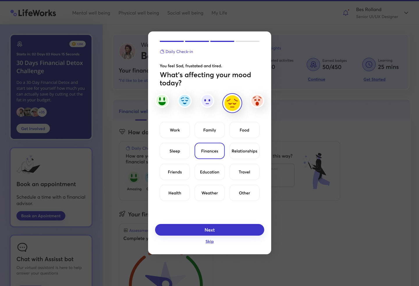
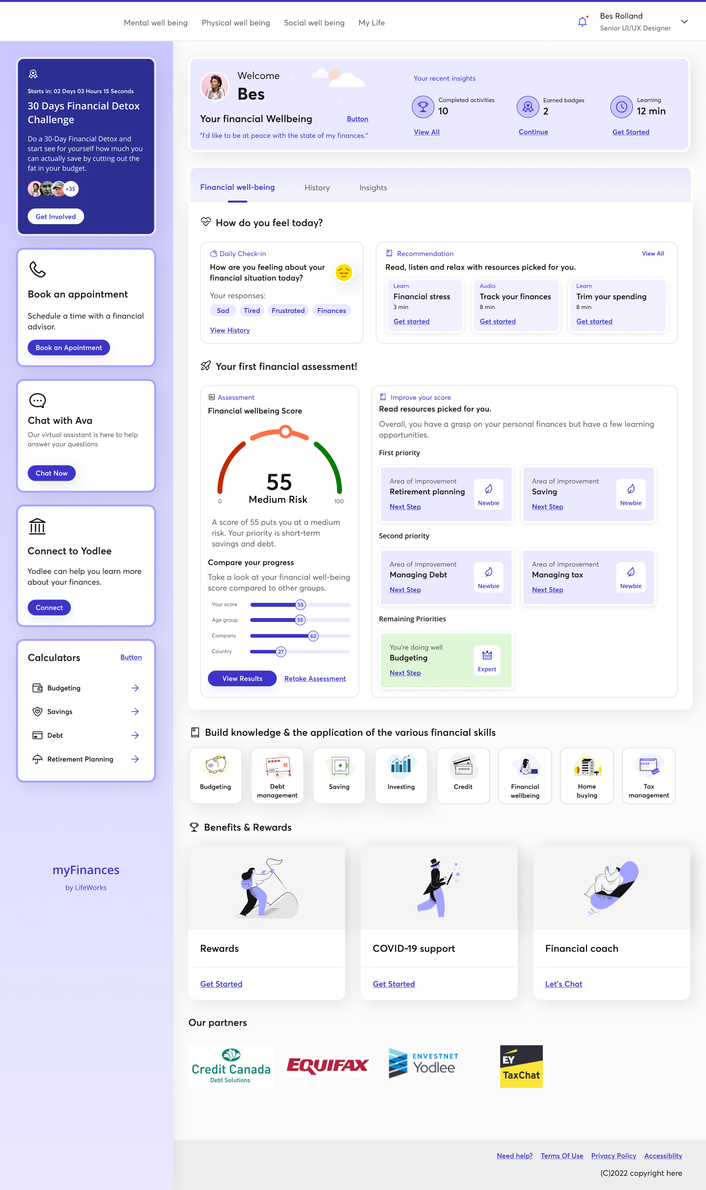
Walk through the shipped flows.

Two interactive prototypes: the full dashboard experience as it shipped to employees, and the assessment-based onboarding that sets the user's prime financial goal. Both desktop, both as designed and built in 2022.

04. Key work & solutions

Five decisions that shaped the product.

Onboarding designed as a 3-step assessment.
Profile, what matters most to you, then the financial wellbeing evaluation. The output isn't a verdict, it's a starting point: a score banded against the FWI's clinical scale and the user's peer cohorts.
A redesigned dashboard with a calmer hierarchy.
The before-and-after isn't cosmetic. The new layout pulled the daily check-in to the top, gave the wellbeing score real estate, and split “elevate” from “build knowledge” so users could tell at a glance whether today was for feelings or facts.
The daily check-in as the keystone habit.
One question, five emoji, optional tags. Designed for thirty seconds, not thirty minutes. Sentiment fed the score and triggered surface-level recommendations, not nags.
Personalization people can feel.
Improvement priorities come from the assessment, not the marketing copy. Two users with different financial lives saw genuinely different homepages, mentor categories, and learning content.
Reusable interaction patterns for the data layer.
Score widgets, peer-benchmark rows, mentor cards, knowledge cards, and assessment screens were all built as patterns the team could reuse across new features without re-litigating the rules.
05. Impact

Directional, NDA-safe.

  • Shipped to Canadian employees in 2022 as the third pillar of LifeWorks total wellbeing, sitting alongside the mental and physical wellbeing surfaces under one employer-funded login.
  • Every shipped feature mapped to one of the four FWI sub-scores. The four-pillar framework (knowledge, behaviour, perception, productivity) became a recurring reference point with the PM, the dev team, and the VP of Product, and the spine of two later product proposals.
  • The interactive prototypes I built were the demo asset the GTM team used when pitching the product to large Canadian employers.
  • Score widgets, peer-benchmark rows, mentor cards, and assessment surfaces became the system the rest of the team built against, outlasting the product itself.
  • “Your employer never sees this” was the most-screenshotted asset in usability sessions, and the line that turned the product from a B2B benefit into something employees trusted with personal data.

The four-pillar discipline, the research-to-product translation, and the privacy posture are what I carried with me into later work.

06. Reflection

Three things I took with me.

i. Money is a wellness topic.
People talk about debt and savings the way they talk about mental health: quietly, with shame, and with one eye on who's listening. The biggest design decision on this product was tonal, not visual.
ii. Defaults beat dashboards.
Users engaged more with the 30-Day Detox challenge than with the analytics tab. Habits are easier to design for than insights are to interpret, especially when the topic is one people are avoiding.
iii. Privacy is the loudest feature.
Saying “your employer never sees this” out loud, on every screen that asked for data, did more for trust than any visual treatment. In a B2B2C product, the second user is the employer. The hardest design problem is making sure they stay invisible to the employee.
The senior takeaway

Finance products over-design the rational layer and under-design the emotional one. You can't math your way out of how someone feels about money. But you can design around it, if every feature is tied to a number that proves it matters.

More work
← Previous

Building trust into a digital CBT platform

Next →

An internal AI assistant for a clinical team